Most useful chart in praxis?
~ Lapajne
Recommended
23.08.2008
Most useful chart in praxis? »
25.02.2008
Table or chart? Perhaps both… »
22.02.2008
Tufte on iPhone resolution »
21.02.2008
Rosling’s bubbles »
20.02.2008
Sparklines – embedded word-sized charts »
The selection of charts in management reporting depends on the message that we want to emphasize. Different charts are suitable for different situations. But if I would have to pick the most useful chart for most situations, I would decide for the combined Actual+Deviation chart.

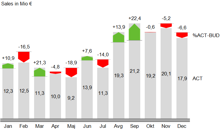
This chart displays actual values as well as deviations (actual vs. target, growth vs. previos year, etc.) at the same time. This solution guides user’s attention to study the changes and immediately warns him about significant deviations.
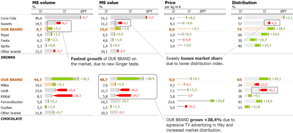
The vertical version of this chart (columns) should be used for displaying time-series, while horizontal version (bars) should be used for all other cases (comparisons of data categories other than time). The latter can also be inserted into tables to form combined table-chart reports.
Here is an example:
The chart depicts actual values as well as the absolute value of deviation. Since both values (the actual and the deviation) are shown, the user can evaluate the relevance of the deviation (the size of the deviation) as well as their relative relationship (the share of deviation compared to actual value) at hte same time). The label can contain either the relative value of the deviation or its absolute value.
We can build this chart by using a few tricks in MS Excel (see Reporting in Excel II). The chart will automatically visualize the data by sizing and coloring the red/green arrow and display the correct labels in the most suitable place.


Comments