Sparklines – embedded word-sized charts
~ Lapajne
Recommended
23.08.2008
Most useful chart in praxis? »
25.02.2008
Table or chart? Perhaps both… »
22.02.2008
Tufte on iPhone resolution »
21.02.2008
Rosling’s bubbles »
20.02.2008
Sparklines – embedded word-sized charts »
In his book Beautiful Evidence (2006) Edward Tufte suggests using small, high density charts that can be inserted directly into their text or number context. He called them sparklines. So what are sparklines, where can we use them and what are their limitations?
Sparkline is a simply designed tiny chart with high information density, that should be placed directly into text or a table, to provide additional context to a single number. It can be a line or a column chart, with the same height as the font size, for example:
![]()
With such a chart we can easily depict several tenths or even hundreds of numeric values in the same space that we would normally write a single number or word:
![]()
By adding a visualization in this minimal space we help the reader understand the context (historic trend) of the single number. With additional context the reader can grasp a better understanding and actual meaning of the number itself.
A sparkline has no scale. It only visualizes the time trend of the single measure (value changes in time). But because time series is one of the most important visualizations in reporting, the sparkline is quite useful in practice. It can be used as an embedded font-sized chart within text, as a chart inside a single cell in tables or as as an additional KPI visualization in dashboards.
Inserting sparklines into tables
One of the biggest disadvantages of tables, for example, is their inability to efficiently present time series. That is why people tend to present only recent values and single-value comparisons in tables. So adding sparklines to tables seems like a very good idea.
In practice we regularly come accross tables that present single actual values compared to single budget and previous year values

while an additional table presents the time series (tipically monthly for the current year):

In this numeric display all numbers are equal. It is true that the table enables us to compare numbers between months, but this task is far too complex without any visualization. Reader will find it very difficult to estimate the trends from this sea of numbers. Such tables can perhaps serve for checking data values but they are certainly not suitable as a means of improving decision-making.
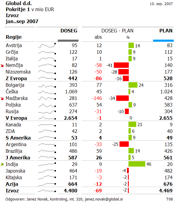
Sparklines, on the other hand, enable us to replace the second table with a single column inside the first table. We insert a sparkline in each cell of the new column. We get the following solution:

The sparkline does not display labels for individual monthly values. It only conveys to us the idea of the trend of a single data category (in our case a particular country) thus adding an additional explanation to the single number in the Actual column. We have managed to present the context of a single value in a small space that helps the reader to better understand the actual values and perhaps also estimate their development in the future.
The pitfalls of using sparklines
We have to be very careful when using sparklines, for we can easily misguide the reader to make wrong conclusions. The only correct way of reading sparklines in the table above is to evaluate the trend for each country (row) separately! Namely, the problem is that each sparkline in the above example has its own individual scale. The sparklines are not correctly scaled across different countries. But in fact, they should be… Why? Because readers will compare the trends between countries. We have a series of sparklines that depict the same measure: Sales. It is inevitable that the users will for example compare the trend of India to Japan and in doing so, they will arrive at a totally wrong conclusion about growth rates.
So we have to ask ouselves, which elements (rows) will the readers directly compare? The answer is not easy, for above table has two hierarchy levels (region, country). So we should further correct the above visualization to ensure two criteria:
- the users should immediately recognize level of hierarchy (differentiate sparklines for regions from countries). We could solve this by emphasizing the regional sparklines (thicker lines, stronger color)
- the sparklines that users will directly compare between each other must have synchronized scale. This means that we should provide the same sparkline scaling for groups of countries within the same region or perhaps even across all countries.

Comments