Table or chart? Perhaps both…
~ Lapajne
Recommended
23.08.2008
Most useful chart in praxis? »
25.02.2008
Table or chart? Perhaps both… »
22.02.2008
Tufte on iPhone resolution »
21.02.2008
Rosling’s bubbles »
20.02.2008
Sparklines – embedded word-sized charts »
We read the tables and see the charts. The picture (a chart or a diagram) enables a direct insight into the situation, while we have to read the table first and only then visualize its picture in our heads. It is hard to grasp a story that a sea of numbers is whispering to us from a table. But since the majority of management reports today is still composed of text and tables, the design of tables represents a special challenge for the reporters.
Undoubtedly visualization is the key means of representing quantitative values. So how can we use visualizations to enhance the legibility and understanding of table-based representations of data?
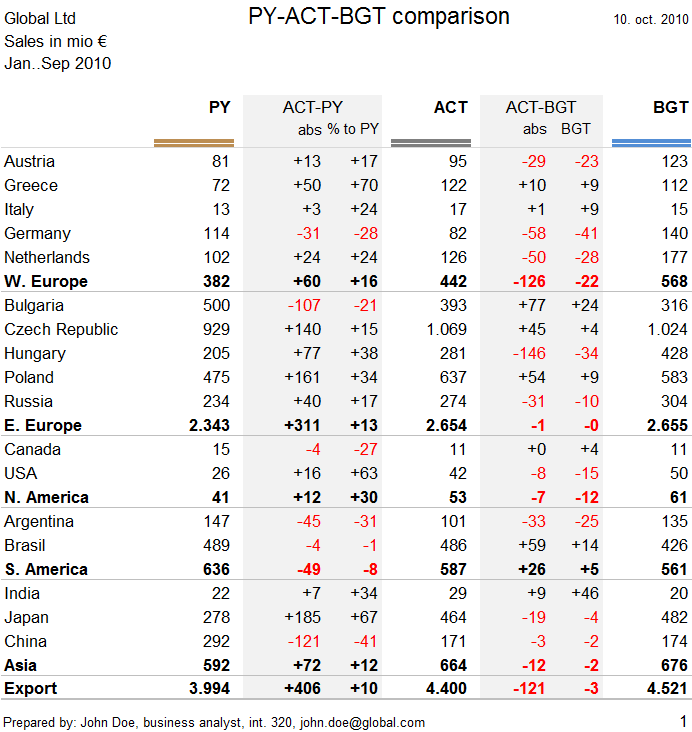
Let us take a common example of a table that contains different data scenarios (Previous Year, Actual, Budget) and deviations or growth rates between those scenarios:
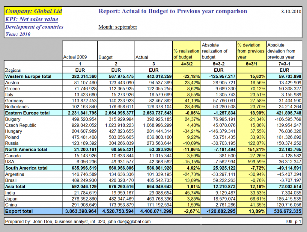
The main problem of this table is that it does not in any way visualize the data. Every month the numbers change and tell a different story, while the table looks exactly the same. The data is not visualized, only the structure of the table is (also not in a very efficient way).
So how do we correct the design of this table? In the first step we should clear any unnecessary design elements and expose the structure (organization) of the table with minimal design, for example:
Now that we have a clean table with a clean structure we can add data visualizations.
Visualization should help the user make comparisons of the most important data. In this case users are probably most concerned about the realization of the budget, either relative (“To which percent are we over or below target?”) or absolute (“How much are we above or below target?”). If we decide to visualize relative deviations, the solution might look like this:
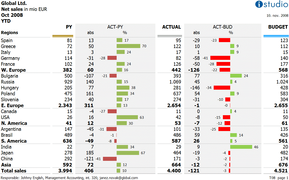
The problem of this solution is that it does not depict the significance of the deviation. Relative deviation should be considered along with absolute deviation in order for the user to fully understand the significance of the deviation. Also we should use more data ink for the absolute numbers (larger numbers, significance) than for the relative numbers, for example:
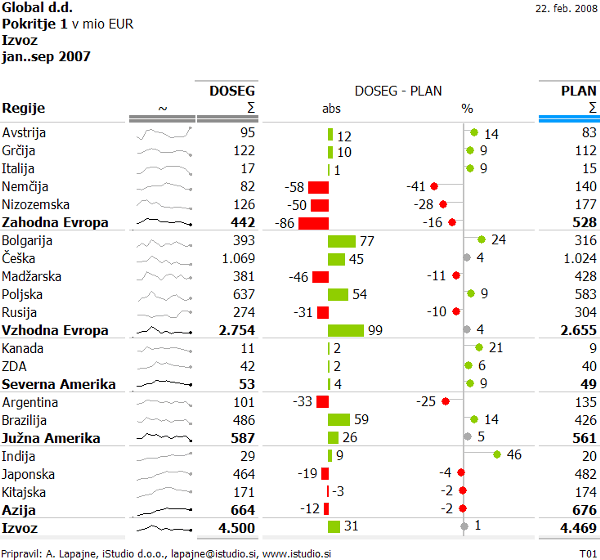
In order for the user to differentiate the two deviations, we have used two different shapes: bar chart for the absolute deviation and dot plot for the relative deviation.
This is better, but there is one more problem, namely relative deviations tend to be larger at small values. They can reach several hundred % on least significant data elements. That is why we should use length only to visualize the size of absolute deviation while we should visualize relative deviation using some other graphic variable, for example the area, the intensity of color or perhaps only a range of a few size classes of shapes. Here is the solution with area size:
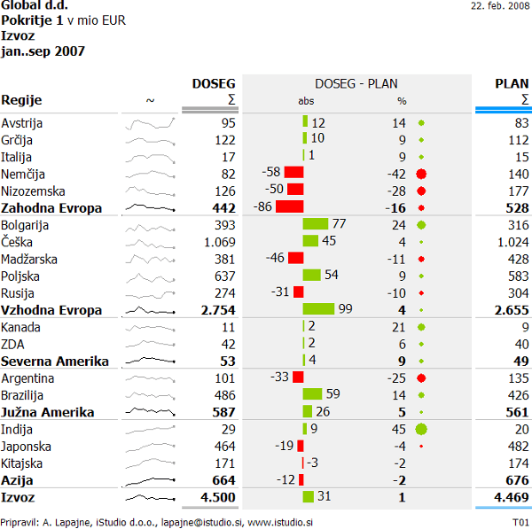
In last two examples we included sparklines to visualize trends for last 12 months of data, thus compensating for the basic disadvantage of tables: they are not suitable for presenting time series. However, one must be careful when using sparklines for they can mislead the user when comparing growth rates between rows (scales should be synchronized), but this is already a topic for another post…

Comments