Dot plot maximizes data ink
~ Lapajne
Recommended
23.08.2008
Most useful chart in praxis? »
25.02.2008
Table or chart? Perhaps both… »
22.02.2008
Tufte on iPhone resolution »
21.02.2008
Rosling’s bubbles »
20.02.2008
Sparklines – embedded word-sized charts »
According to the Data Ink theory (E. Tufte, 1983), the dot plot is actually the most optimal chart type. Since it uses minimal graphic representation to depict numbers, it has the largest data-ink ratio. The good side of these kind of visualizations is that they can depict a high volume of data and are still legible. Of course data ink maximization is just one of the criteria of efficient data visualization, but it is a very important one.
Dot plots are most commonly used as so called “Scatter plots” or “XY charts”. A scatter plot is suitable mainly for analyzing correlation between two variables or to analyze outliers (data that does not conform to patterns or in some other way stands out of a particular population). But let us take a look at some other examples of a dot plot, that are very useful in management reporting.
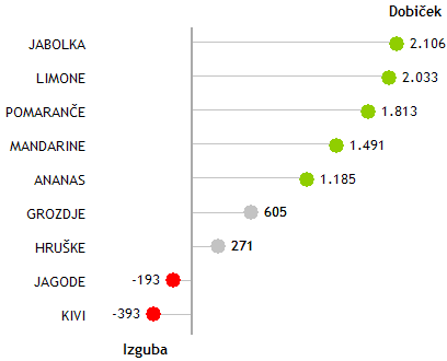
First a simple chart representing profit or loss comparison across a single dimension:

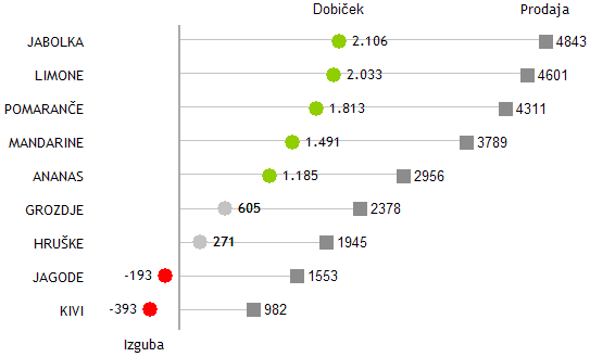
We can easily add another variable to such a chart, for example the sales:

The chart is extremely legible and also enables us to depict large sets of data.
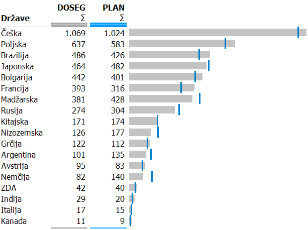
We can combine dot plots with other chart types. For example, we can combine a dot plot with a bar chart to visualize actual sales values compared to planned values:

This chart efectively visualizes the comparison of absolute Actual and Budget values. We also used color coding for data scenarios (Actual, Budget) that help us link the values in the table with the shapes in the chart (grey = Actual, blue = Budget). But it has two drawbacks
- it is not a good idea to mix different shapes for the same measure (sales) and more importantly,
- it does not explicitely visualize the deviations.
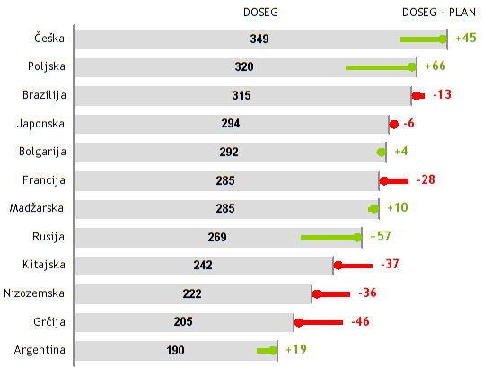
So let us correct that:

We have arrived at a combined graph suitable for display of absolute values as well as deviations at the same time.

Comments