Deviation analysis: How to display deviations?
~ Lapajne
Recommended
23.08.2008
Most useful chart in praxis? »
25.02.2008
Table or chart? Perhaps both… »
22.02.2008
Tufte on iPhone resolution »
21.02.2008
Rosling’s bubbles »
20.02.2008
Sparklines – embedded word-sized charts »
Monitoring deviations (e.g. from plan or budget) is one of the key tasks of a controller or a business analyst. Controlling without some form of a plan or comparison to preset goals or benchmarks does not exist. This leads us to the following question: what is the optimal way of displaying deviations? We will call this task deviation analysis.
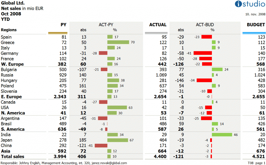
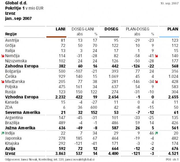
Business analysts in most companies would in practice most probably use tables, such as:
The table structure should be understandable, as it is in our case: the columns containing absolute values (Previous Year, Actual, Budget) are color-marked to emphasize the organization of columns, between them the deviations are calculated (both absolute and relative). The most important deviations are further emphasized with a highlight.
The highlights guide user’s attention to the most important parts of the table. Which is generally a good thing, but in this case also a bit problematic, because such “binary logic” forces us to decide on a single threshold. Values above the threshold are emphasized while all others are not. If we for example decide to highlight only deviations that are larger or equal to 20%, is the deviation of 19,9% not worthy of the reader’s attention? This is a general problem of visualizing continuous (numeric) data with discrete classes of shapes or sizes.
That is why the following solution with a chart depicting all deviation values is better:

Every deviation is visualized according to its size. A table-chart combination is often a good solution, because charts enable the reader to rapidly see and compare important data categories or measures, while tables support further reading or lookup of other values thus enabling the reader to further investigate the context of a particular deviation.
We have managed to show the (relative) deviation, but we at the same time failed to show the significance of the deviation (its relation to the actual sales value) which is very important for the understanding of the deviation’s impact.
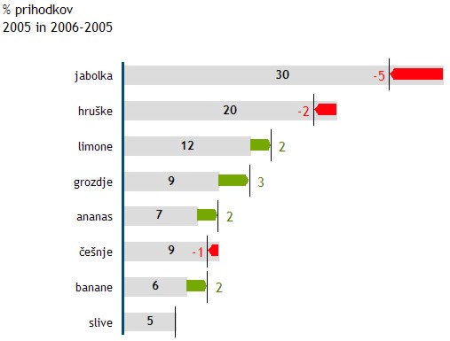
This can be achieved in the following way:

The deviations are still correctly visualized, while the reader can also quickly evaluate the significance of a particular deviation by comparing it visually with the absolute actual value. Both values (actual and deviation) are labelled and we can decide whether to display the label of absolute deviation, relative deviation or both (in most cases the label of the relative deviation is enough).
The above solution is suitable for all cases where it is important to guide the user’s attention to the deviations. For example when studying realization of a budget, growths from previous year, etc.
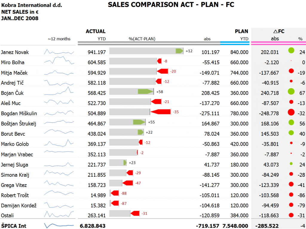
The nice characteristic of the above chart is also that we can insert it into tables. For example:


Comments