Condensing bar charts into dot-plot
~ Lapajne
Recommended
23.08.2008
Most useful chart in praxis? »
25.02.2008
Table or chart? Perhaps both… »
22.02.2008
Tufte on iPhone resolution »
21.02.2008
Rosling’s bubbles »
20.02.2008
Sparklines – embedded word-sized charts »
Dot-plots are generally efficient charts because they have very high data-ink ratio. Let us see how we can condense two bar charts into a single dot-plot.
Let’s explore the following case: we want to compare products by their sales values and profit (or loss). We will visualize to sales values with a simple bar chart:
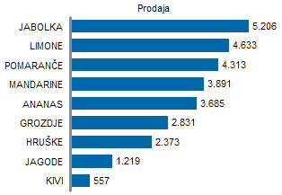
Here is another chart for profit and loss:
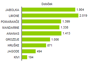
If we want to present the two series together to facilitate the sales-to-profit comparison for each category, the first idea is usually to put them into a single chart with two data series:
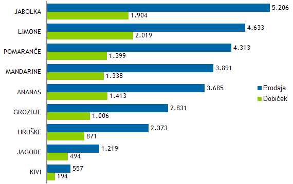
This chart has several disadvantages:
- it is legible only when there is a small number of data points (products). With a high number of data points the charts becomes hard to read and to make data comparisons,
- there exists an alternating rhythm of the first and second series, which causes a frustration when we visually process the picture (visual attention switches here and there between the rows of both data series),
- we are using a color-coded legend, which is not a good way of labeling data. The lookup operation to search for the right label based on a color value is slow, especially with larger number of series and leads to greater problems when printing reports in black and white.
We can try to solve this by separating the two series into two charts:
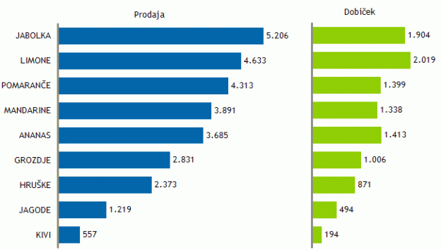
Since we want the user to compare sales to profit, we have to make sure that both charts use a synchronized scale. The immediate advantage of this solution is that it can show twice more data points (more rows) within the same height. This is especially important when representing larger data sets.
Of course there are many alternatives of visualizing the described data. On of them is to use a dot plot:
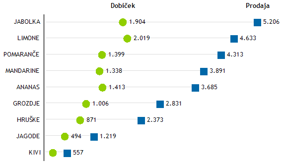
This solution is better for several reasons. The chart is extremely legible. All labels (values, category names and names of series) are displayed at the most appropriate positions. The chart is very “clean” according to the Data Ink Theory (uses minimal ink) and also occupies the smallest amount of space. In a chart like this we can easily present a large number of categories (products).

Comments